

More than a quarter of all MPS portfolios currently available on-platform are classified as passive – with ‘passive’ here taken to mean portfolios (excluding cash) made up of at least 90% passive instruments. This has not always been the case.
The regulator’s focus on cost – or, more accurately value for money – came to the fore in the Asset Management Reviews (interim and final) of 2016 and 2017, where there was specific mention of what they saw as an underuse of passive instruments. It is no coincidence, then, that 35% of the passive MPS portfolios now available on-platform have been launched in the last five years.
While it is not necessarily the job of data providers such as Defaqto to prescribe the way advisers go through their selection process, it is our job to provide the right tools and data. With this in mind, Defaqto has launched two new series of MPS Comparator benchmarks – one for passive portfolios and one for active portfolios. Both series are subsets of the whole-of-market MPS Comparator benchmarks launched last year.
In many respects the launch of these latest benchmarks is a live demonstration of how we, as data providers, evolve in serving the adviser market. For us, the launch of the Defaqto MPS Comparator benchmarks was a game-changer – and the same goes for advisers and discretionary managers too. For the first time, like-for-like comparisons of MPS portfolios in similar-risk peer groups could be compared against a benchmark made up of real portfolios.
Next step
The success of these benchmarks, coupled with the growth and popularity of passive portfolios, made it an obvious next step to launch active-only and passive-only benchmarks. Internal analysis showed the second most popular filter for MPS portfolio selection – after cost and, crucially, ahead of performance – was the active/passive filter, which underlined the need for these new benchmarks.
Regular readers of this series of articles will have noticed the ongoing focus on what insights can be provided through good, comprehensive data and using the right tools to carry out that analysis. We have, for example, noted that while passive portfolios are, on average, lower-cost than active portfolios, there are exceptions. We have looked at returns and showed that lower costs do not always translate into better performance.
Just as importantly we have shown that above-average costs does not necessarily translate into poorer performance. This means that value for money can sometimes come at a higher cost. The following table showcases the clear and very distinctive differences that can be found when exploring a Defaqto MPS Comparator and its sub-sets of active and passive:
“Internal analysis showed the second most popular filter for MPS portfolio selection – after cost and, crucially, ahead of performance – was the active/passive filter.
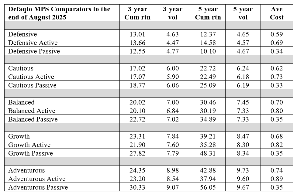
Source: Defaqto
Just to add to the potential confusion, we have also highlighted that more than half of the passive portfolios out there do not contain ‘passive’ or ‘index’ in their title. So, although we have always had the data, formalising it in this way makes analysis much more efficient and I look forward to unearthing more revelations in future articles.
Just as a teaser and something to think about, the next chart shows the distribution of portfolios making up each Defaqto Comparator passive benchmark:
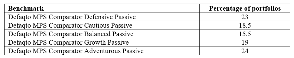
Source: Defaqto
Bear in mind this is a subset of the full Comparator benchmark, which has a relatively even distribution – begging the question as to why there are considerably more portfolios at each end of the risk scale. Answers on a postcard, please …
Andy Parsons is head of investment & protection at Defaqto