

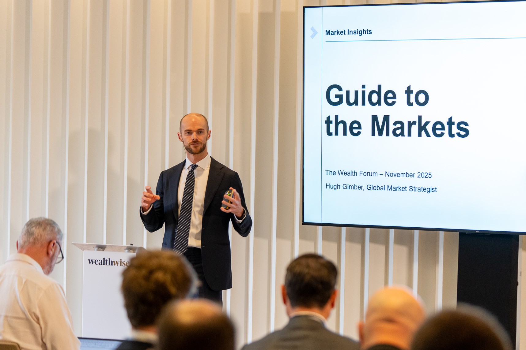
Buoyed by the stimulative fiscal policies of the US and other western governments, equity and bond markets are painting a rosy picture of 2026 yet, as ever, investors cannot afford to drop their guard. Indeed, as Hugh Gimber, global market strategist at J.P. Morgan Asset Management, tells the audience of Wealthwise’s Autumn Wealth Forum earlier this month: “History teaches us excess stimulus can create inflation and asset bubbles.
“To be clear, I see these as tail-risks for 2026 – our base case is continued expansion, continued gains in equity markets and that bond markets are pretty fairly priced today – but there are key factors to track closely to ensure that optimism holds.” You can find his thoughts on the risks posed by Potential spoilsport #1 inflation here while this time he looks more closely at two others – bond vigilantism and capital misallocation.
Potential spoilsport #2: Bond vigilantism
“It is not just inflation that could push bond yields higher next year,” notes Gimber. “We also have fiscal risks to grapple with.” Pointing to the following pair of ‘big-picture’ charts, he adds: “These put this into context and show the issue facing the UK government is, quite frankly, similar all around the world. This is that we have rapidly-ageing populations, which are going to strain government finances more and more.”
Fiscal pressures are only getting tougher
“Rather than simply marrying equities and bonds together, a well-built portfolio for 2026 needs to think about diversifying across this whole range of tail-risks.
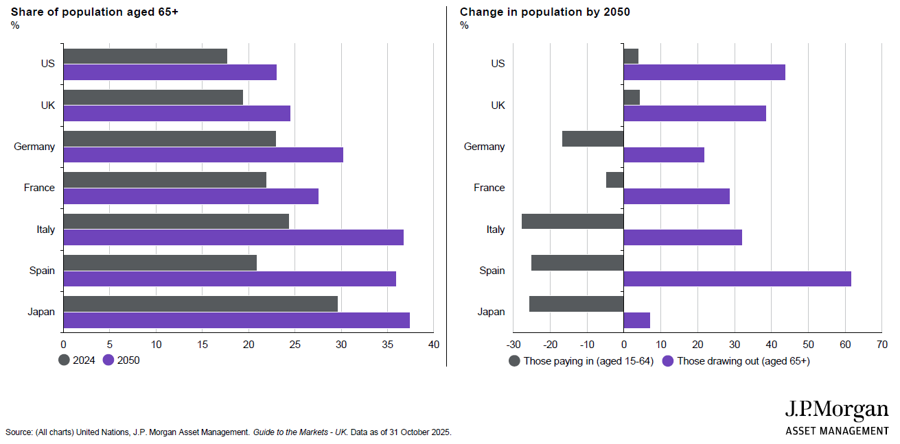
The lefthand chart shows the share of selected countries’ populations aged 65 and over, with the grey representing the current situation and the purple where these are forecast to be in 2050. Between now and then, adds Gimber, the number of people aged over 65 is expected to double while the number of people aged over 80 is expected to triple – but why does this matter so much?
“Typically, 65 is the cut-off point where someone is no longer a ‘net addition’ to government finances through taxes and they start to become a ‘net negative’ in terms of money being added to the pot,” he explains. “So governments are facing increasing spending costs and lower revenues because, not only is the tax pot going to shrink but, as we all know, the costs involved with health services, say, increase as a population ages.”
Read ‘Part 1’ here: Hugh Gimber: What might upset risk sentiment in 2026?
The righthand chart frames this idea in a different way, showing the change in proportion of those ‘paying into’ the system and those ‘drawing out’. “Forgive these very broad terms,” says Gimber “but you can see the grey bars are generally shrinking across these nations. In some ways, then, the chancellor might reasonably ask, Why is the UK being penalised so much when this situation is also going to apply everywhere else?”
The UK-specific problem becomes clear from what Gimber describes as “the scariest chart I am using in any circumstance at the moment”. On the left, below, the purple line is a spending forecast for the UK government while the grey one is the revenue forecast – and the current political environment means all the discussion ahead of the Budget was about looking to increase the grey rather than trying to do something to address the purple.
The chancellor is in an unenviable position
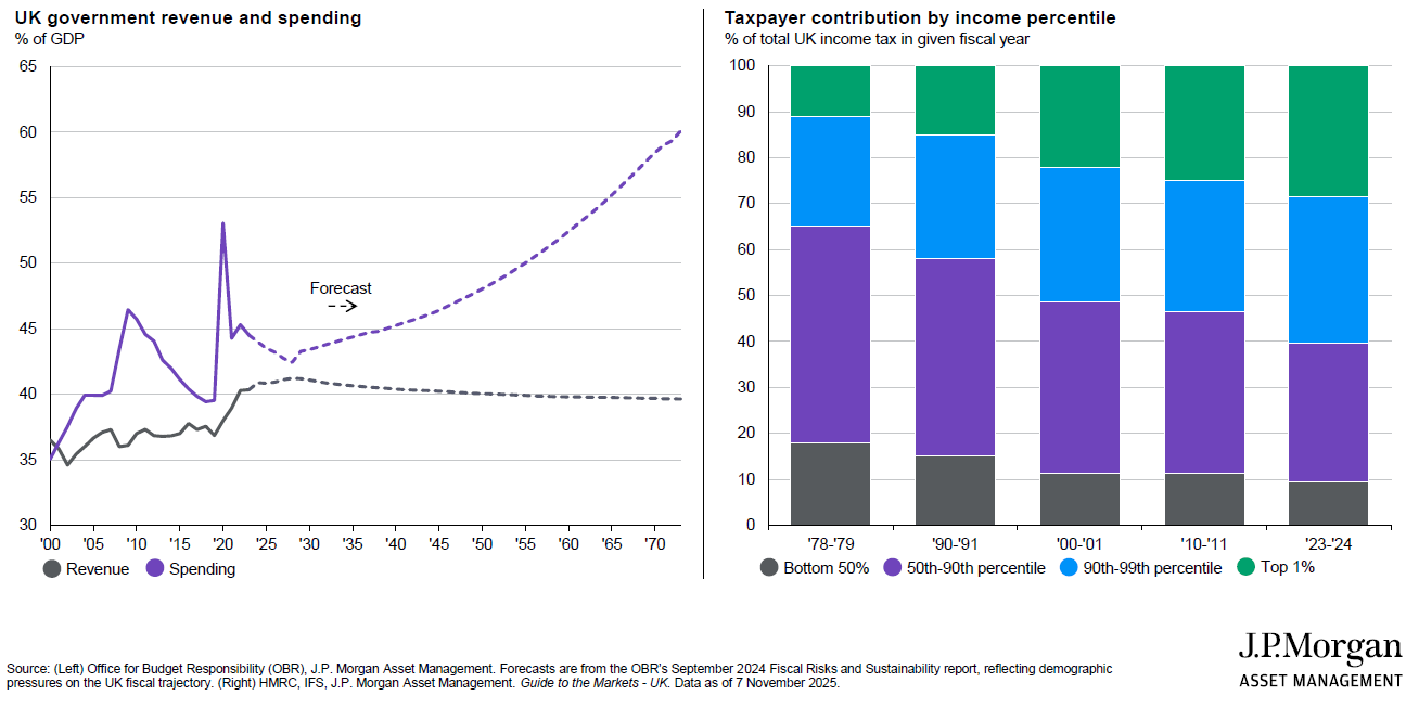
“Arguably, there is a broader question to be asked here but the challenge we now face in the UK is we are reaching the limits of what this economy can tolerate in terms of taxes,” Gimber continues. “As a client said to me a while back in the context of the pressure on the wealthy in the UK, ‘Those with broad shoulders also have legs’ – and we are seeing that show in the data in terms of the growing number of people moving overseas.”
Take, for example, the righthand chart above, which shows the evolution of the share of UK income tax paid by different income groups. Combine the green and the blue and you are looking at the top 10% of earners in the UK economy – and, in the late 1970s, those top 10% of earners were paying roughly a third of the overall income tax-take. Today, the top 10% of earners are paying much closer to two-thirds of the total.
“For the chancellor simply to say, We need to nudge the revenue line up is really difficult as you start to hit the Laffer Curve problem,” says Gimber. “US economist Arthur Laffer framed the idea that, if you keep increasing tax rates, you eventually go past the point where you keep increasing the overall tax-take because people start to move their wealth overseas or even conclude it is not worth them working anymore.
“George Osborne had this problem in the 2010s, when he increased taxes and found the tax-take went down. Then he cut taxes and found the tax-take actually started to go up again. This is what we are hitting up against in the UK – and yet, on the other hand, the government cannot tackle spending because, as we have already seen this year, welfare and other cuts are incredibly unpopular with the Labour back-benches.
Disciplining force
“So you have a chancellor who is basically facing pressure from her own party on one side while, on the other, the gilt market is telling her, You absolutely cannot change your fiscal rules – we need you to deliver something that is credible.” Making life even harder for the chancellor, adds Gimber, is she has even less room for manoeuvre because of how Kwasi Kwarteng’s mini-Budget derailed the gilt market three years ago.
“What is clear here is the gilt market is speaking to the government – and the government is listening,” he continues. “So the big-picture point is we need to get more used to the bond market being the disciplining force. We saw that in the UK in September 2022 and we saw that this year on 2 April, with ‘Liberation Day’ in the US, when Trump held up his huge board to announce all the different tariff rates.
“Six days later, the US treasury market was creaking – and arguably that is what forced the U-turn on 9 April, when Trump chose to rein things back. We also saw the same thing in France over the summer – political division followed by the bond market stepping in and saying, You cannot get away with this and you need to find a compromise. And indeed, they have.
“So this bond vigilantism is another theme we need to track very closely because we will see it more and more – and the fixed income part of a portfolio is going to be more volatile as a result. It does not need to have dire implications for long-term returns but it does mean you are potentially looking at more and more frequent scenarios where equities and bonds are coming under pressure simultaneously.”
Potential spoilsport #3: Capital misallocation
The third potential spoilsport Gimber identifies is capital misallocation which, as he points out, returns us to the discussion of asset bubbles he began with. “Maybe we are looking at a scenario where it is not actually consumer prices that are going to show most of this excess,” he adds, “but, rather, asset prices – akin to what we had during the long period of QE.”
For Gimber, though, there is a clear difference between today’s market highs and, to take a popular point of comparison, the dotcom bubble of the late 1990s. Referencing the lefthand chart below, for example, he notes how Nvidia’s share price and earnings have effectively moved in tandem over recent years. “If you did the same for Cisco in 2000, however, you would have prices flying and earnings nowhere near,” he continues.
There are clear differences today relative to the dotcom boom
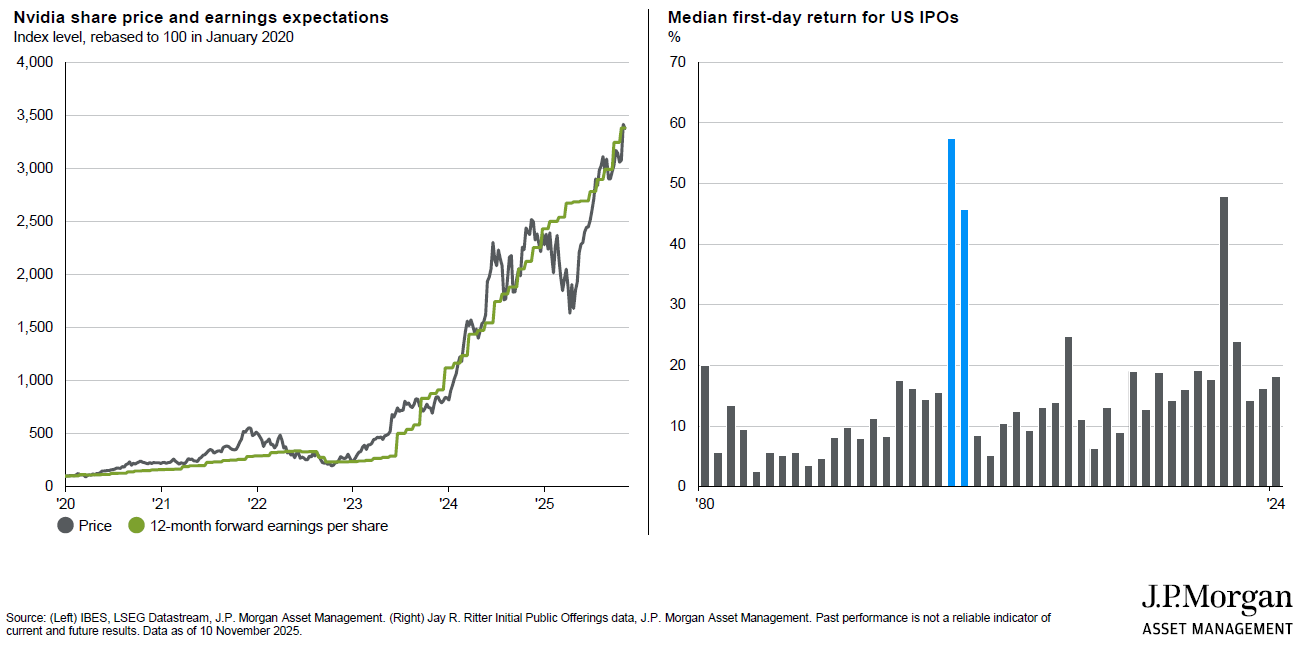
“In contrast, the present generation of tech giants have earnings and balance sheets that put them in a very different position financially to what we saw 25 years ago. The righthand side, meanwhile, is a slightly different way of looking at this and uses some brilliant data from Jay Ritter at the University of Florida – the leading expert on all things IPO-related – to think about some of the behaviour we are seeing in capital markets.
“This chart, which goes back to 1980, shows you the median one-day return for the day after a company went public and the two blue bars I have highlighted are 1999 and 2000. In 1999, the day after the median company listed, it went up 57%. In 2000, it went up 45% – again, in a single day. So young, aspirational tech CEOs were effectively being told, We could massively increase your wealth in a day if your company lists ASAP – and so they did.”
As a result, the average age of the businesses coming to market in 1999 was just four years – compared with 14 years in 2024. “That means the balance sheets and business models of these companies are that much more established,” notes Gimber. “It also means, if you are hunting for AI’s winners today, there is a good chance they are still in the private markets and so maybe smallcap investors are now going to have a harder time.
“The route to public markets is changing from, Get to smallcap, then midcap, then largecap: more commonly now, it is a few different rounds of private-market funding and then, Boom, let’s go to largecap straightaway.” Less positively, however, as much as the tech giants of today might be able to point to significant earnings, they are also spending huge amounts of capital.
Pointing to the lefthand chart below, Gimber continues: “As the AI hyperscalers are building more and more data-centres, about half the money they invest is on chips. So Nvidia thinks, Brilliant! If they need more chips, we can spend more money on R&D and make more sophisticated chips – and so those chips you hyperscalers bought a couple of years ago? Well, you are going to buy some more because we now have even better ones!
Investment booms have an unfortunate habit of turning to busts
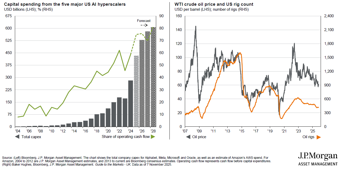
“At the moment, however, the demand coming through the pipes is not yet enough to turn a profit for all the different parts of the AI ecosystem so the hyperscalers have been saying, Don’t worry, we will foot the bill for now – because if you are Microsoft, say, you have lots of other businesses generating lots of cash and so you have been able to fund this through free cashflow.
“Yet that free cashflow is starting to become exhausted, which shows up as the green line on that lefthand chart – the share of cashflow that is being consumed by the capital expenditure of the five largest AI hyperscalers. And, the higher that goes, the less free cash there is available to keep funding these commitments – which explains why, in recent months, the likes of Meta and Oracle have begun to tap the debt markets.”
Gimber picks out the US shale boom of the 2010s as a good example of the “unfortunate habit” investment booms have of turning to busts. “You very rarely see this kind of acceleration in investment without it one day leading to overcapacity,” he warns. “On the righthand chart, oil prices are in grey and oil rigs in orange – and what happened coming out of financial crisis? Oil prices soared and energy producers wanted a piece of the pie.
“And what does that large increase in oil rigs do? Eventually, all of that investment leads to overcapacity and oversupply and therefore, when you hit a wobble in the economy and oil prices crash, oil rig numbers necessarily tank afterwards. And so, from 2015 to 2018, we had wave after wave of energy defaults because all of this investment had been put in place, which then led to a massive overcapacity problem.”
All eyes on AI demand
So how does the AI industry avoid a similar scenario? “We need to see demand accelerating,” says Gimber. “And this is what we are tracking incredibly carefully – though, frankly, with very conflicting data so far. If everyone here had ChatGPT downloaded on their phone, for example, the data suggests only 5% of people would be paying for that currently – and US census survey data presents a similarly muted picture.”
Here Gimber highlights the question being addressed in the lefthand chart below, adding: “The phrasing here is critical. It is not, Are you finding time-savings or more productivity? This is, Are you actually using AI to demonstrably produce something you can then sell to others? And, as things stand, about 10% of US businesses are telling us they are doing so.
Adoption needs to accelerate to justify the current AI premium
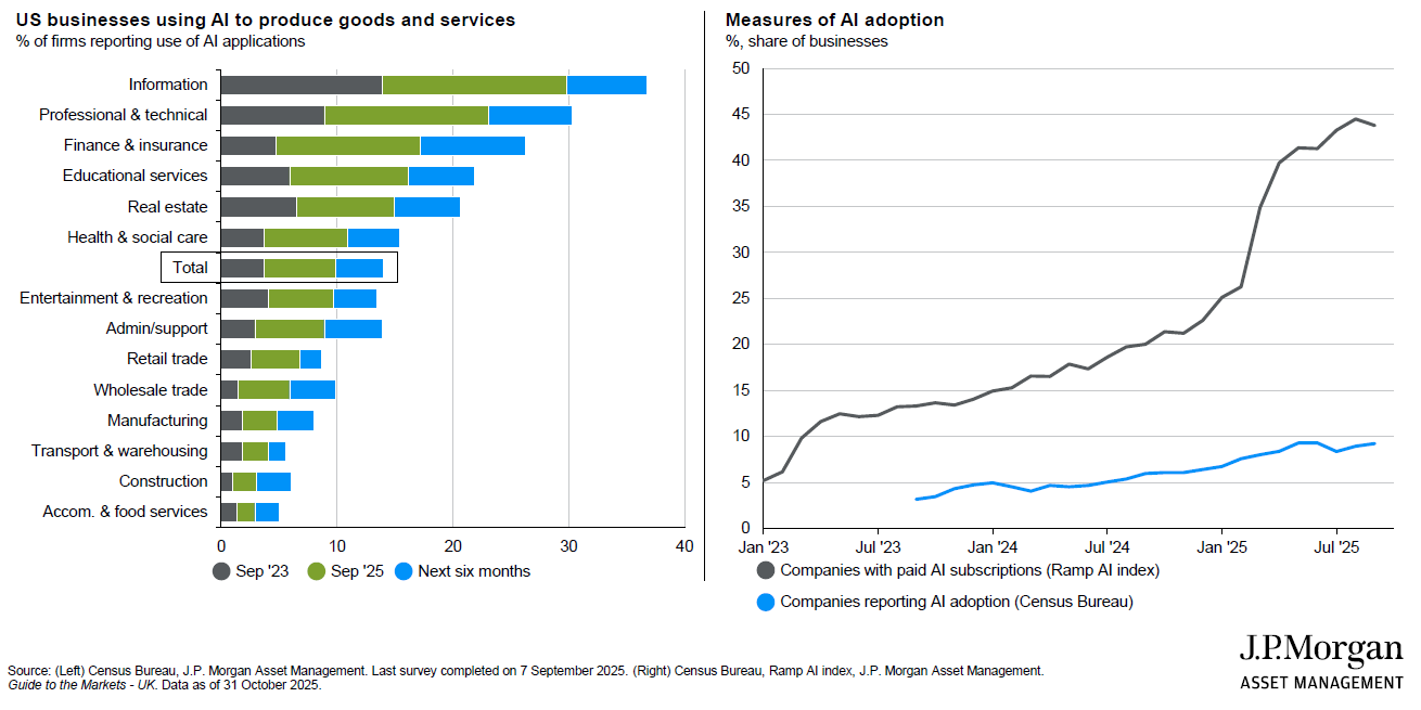
“OK, this is an increasing trend but the time series of the totals in the lefthand chart is the blue line on the righthand one, which has only been edging higher over time – whereas, with a more open-ended question on AI, you get the grey line. This is good news – we are seeing more and more adoption – but, for greater confidence this capex story will not lead to overcapacity, I would like to see the blue catching up to the grey.
“We also need to know AI is delivering an economically significant difference to its users. Yes, there is genuine academic research to suggest there are time-savings, but what are people doing with that time? If you have a longer lunchbreak because your morning was more efficient, economically speaking, that is not a productivity gain. It may be a quality-of-life improvement but it will not show up in stronger revenues or GDP levels.”
For Gimber then, the jury is still out on the capex question although he adds: “If OpenAI did IPO next year, it would be an acid test of appetite for this type of technology. Still, through earnings season, more important than asking the chipmakers or hyperscalers how they see the world is asking other sectors, How are you spending on this technology? That would offer some comfort that future spending will eventually justify current investment.”
Diversifying options Gimber concludes by discussing what each of these three potential risks would mean for portfolio diversification in 2026. “If it is the ‘capital misallocation’ problem, then bonds are your best diversifier by far as this would be a deflationary bust,” he says. “Think about what it would do to US consumers, in particular – all the positive wealth effects of rising stock prices they have benefitted from in recent years would very quickly reverse.
“You would have a slowdown in retail sales and, in that kind of scenario, the Fed would need to be seriously moving to bring rates lower. Whereas the other two are very different scenarios for portfolio construction. If it is ‘sticky’ inflation and wages starting to pick up, then bond yields really will not enjoy that; while bond vigilantism would, by definition, be a scenario where bond yields are rising, putting equities under pressure.
“Ultimately, diversification is becoming more complicated and the demand for diversifiers that are not only core fixed income is growing stronger as well. With that capital misallocation scenario, bonds are the only place you would want to be – but, rather than simply marrying equities and bonds together, a well-built portfolio for 2026 needs to think about diversifying across this whole range of tail-risks.”
This is an edited version of the second half of the keynote speech Hugh Gimber, global market strategist at J.P. Morgan Asset Management, presented to the audience of Wealthwise’s Autumn Wealth Forum on 13 November 2025. You can read the first half – on the risks posed by inflation – here while J.P. Morgan Asset Management’s 2026 Investment Outlook ‘Fuel in the Engine’ can be found here